Dirty Dough Cookie Trailer, Take 2.
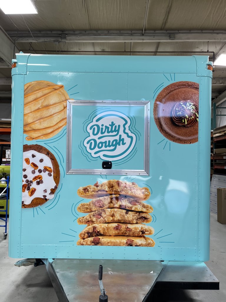
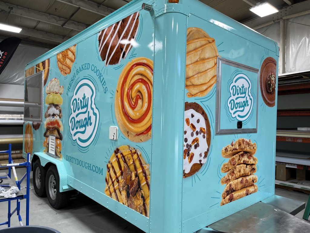
This new design needed to have a blue background instead of an orange background, like the original.
Here’s a look at the new, blue color:


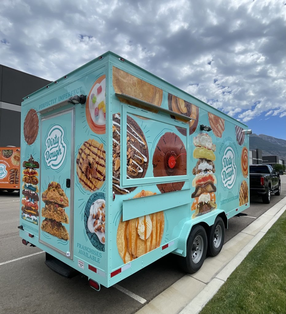
I love this photo because you can see the older, orange trailer in the background:

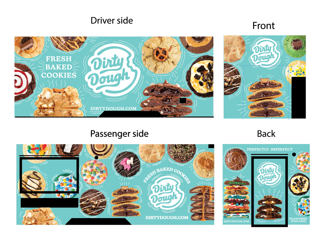
My newest designs are pictured below. They wanted to go with a darker blue background and white print/illustrations. I don’t have photos of the final product, but here’s a look at what the newest designs look like:

Hopefully I’ll get to update this post in the future with some photos of how this most recent design turned out.
