Food Truck Design
posted in Graphic Design, Graphic Design, Identity Design by admin on July 30, 2022Adding graphics to trucks was a fun experience! While this area of design was new for me, it was fun to push myself and design a new kind of surface. After designing the wall murals for Dirty Dough, it was a little less intimidating designing on a larger scale.
Kona’s Ice Cream and Smoothies
The first design I created was for Kona’s Ice Cream and Smoothies for the Wolfe it Down Food Court in Rexburg, Idaho. For this, I used several different graphics purchased on Adobe Stock and put them together in a new and interesting way. Because Kona’s is the name of the business, I immediately thought of Hawaii. They serve Hawaiian smoothies and shakes, so I wanted the food truck to look like a VW Bus serving smoothies on the beach. The surfboards on the left are where the menu will be printed and added later.
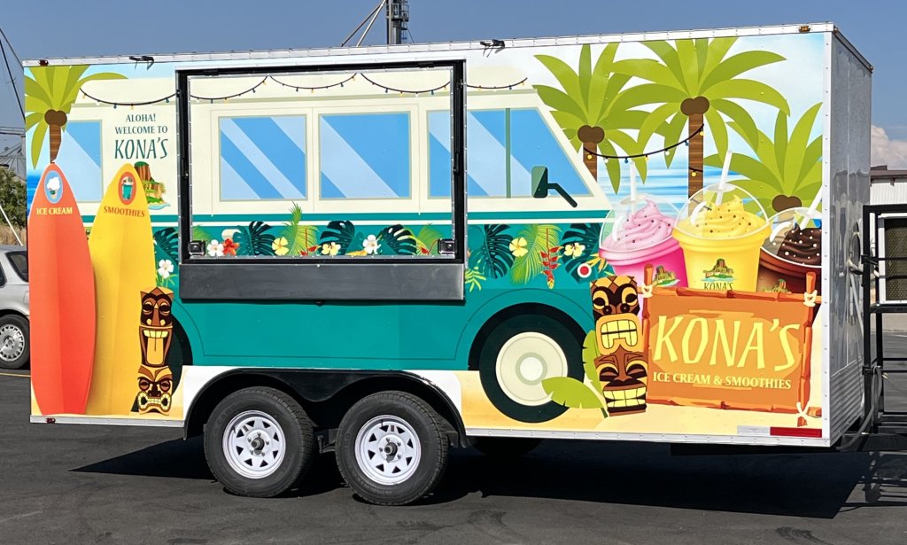
by Christie Bryant
Below is a look at where the Kona’s food truck sits, located at the Wolfe it Down Food Court, next to Wolfe Lighting in Rexburg, Idaho.
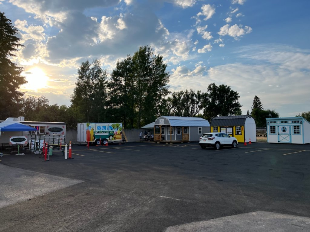
Rexburg, Idaho
The truck parked in it’s new home:
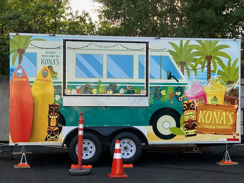
designed by Christie Bryant
Dirty Dough Cookies Food Truck
Updated with Dirty Dough Food Truck August 26, 2022
The Dirty Dough Cookies brand has a very simple color pallet. Three shades of blue, one of orange, and a dark brown. The main color is the blue in their Dirty Dough logo but almost everything in the franchise businesses is that same blue (the murals, boxes, t-shirts, walls, etc.). With the food truck design, Corporate decided to go with an orange background.
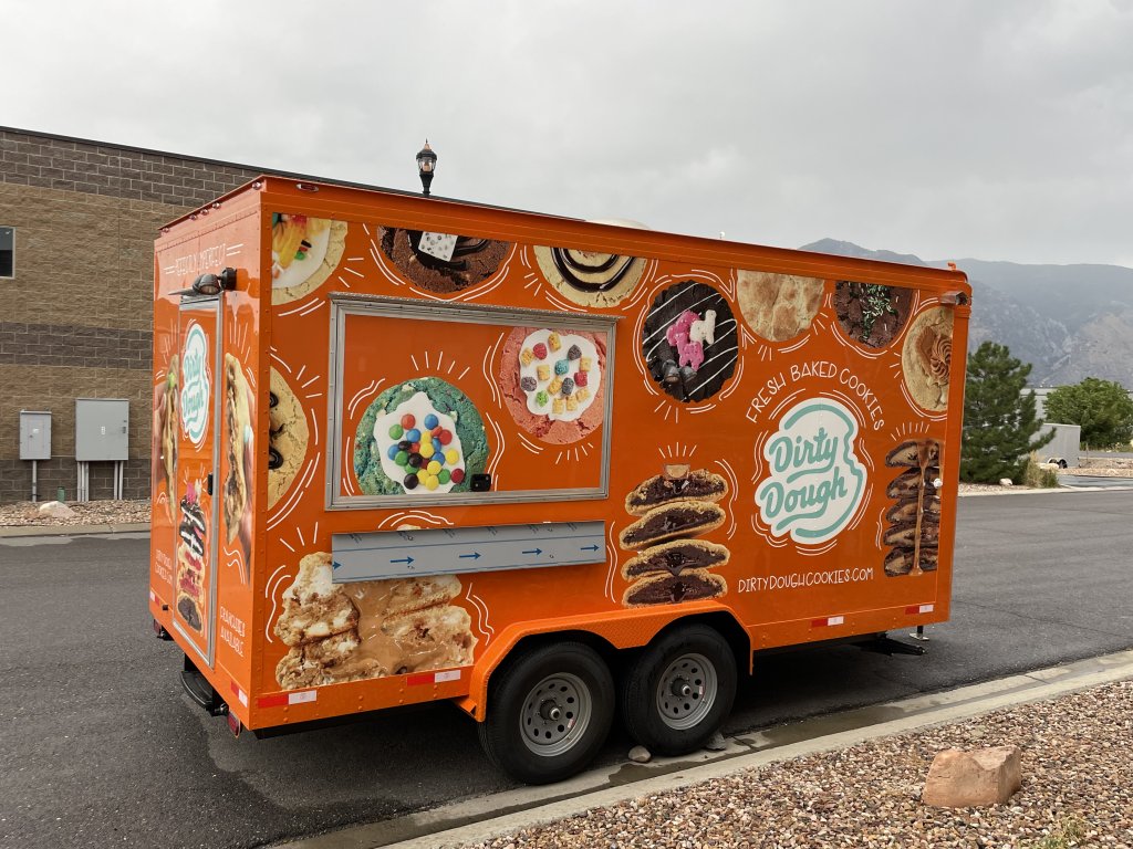
designed by Christie Bryant
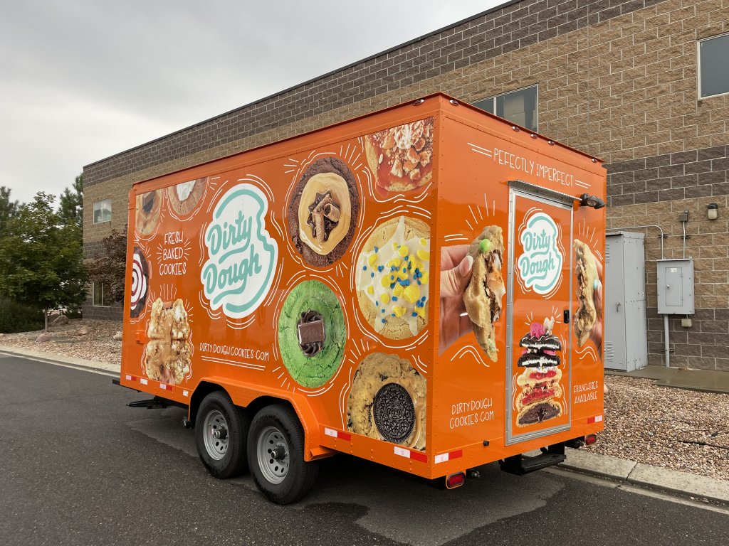
designed by Christie Bryant
Initially, I sent them a quick sketch of the cookies with little outlines around them. It was just a first draft but they loved it, so I went in that direction with the design. It literally had to be designed in 2 days (rush, rush) but I’m happy with the way it turned out.
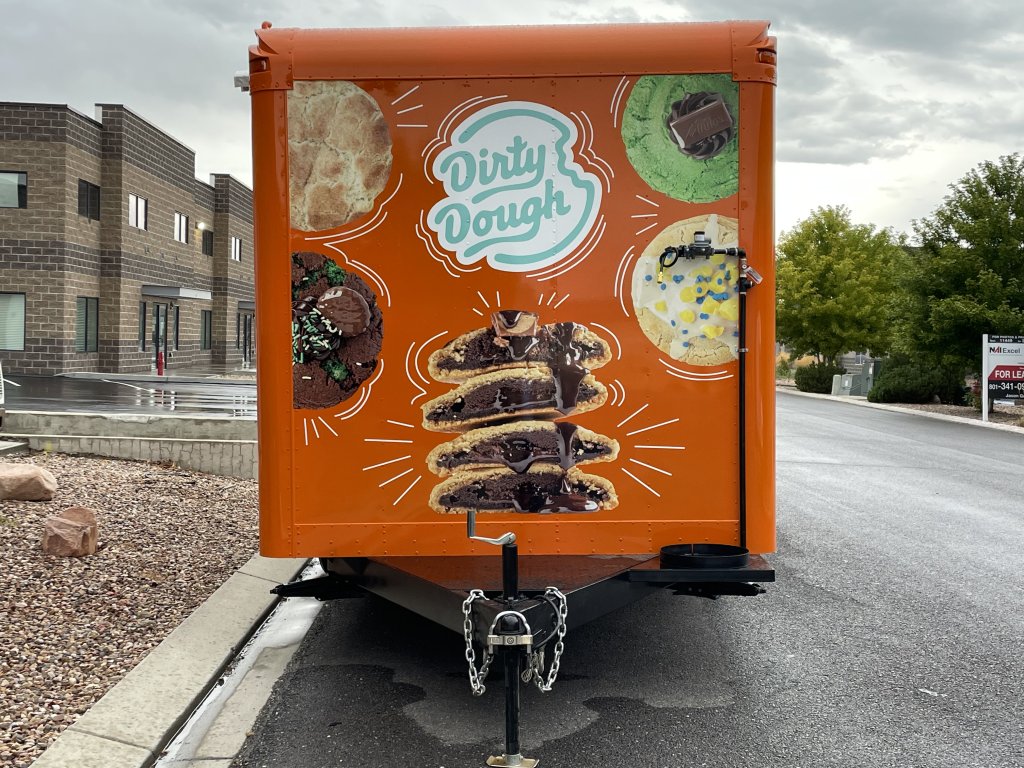
designed by Christie Bryant
Dirty Dough Corporate especially liked my idea of putting the back door between cookie split in half. It turned out fun!
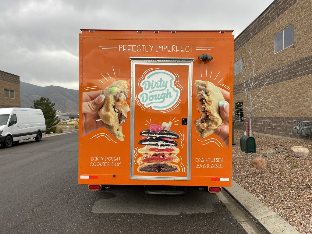
Updated with video 9/22/22
A post by Bennett Maxwell, founder of Dirty Dough Cookies:
Dirty Dough Cookies Shipping Truck
The Semi Truck was another last-minute design for Dirty Dough Cookies (they like to put the pressure on). The truck features the main Dirty Dough blue color in the background with stacks of their delicious cookies. The thought behind this one was to tempt cookie-lovers into taking a detour to the nearest Dirty Dough Cookie location.
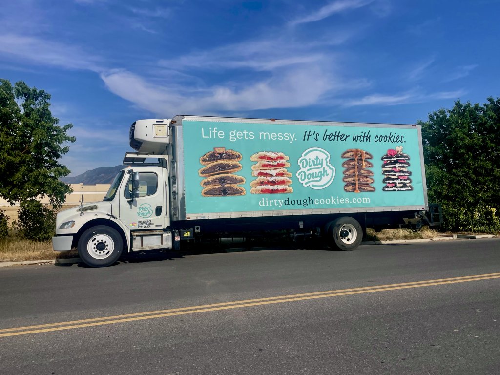
Design by Christie Bryant
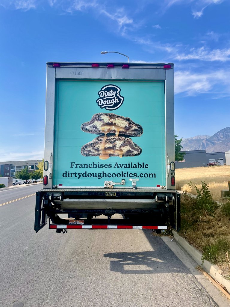
Design by Christie Bryant
Even though each of these projects was created in less than a week, and there are definitely things I would change if I had more time, I was pleased with the way each of the trucks turned out.

Pingback: Cookie Trailer Design – Clever Christie