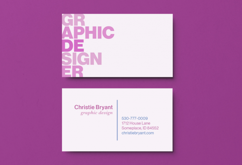
This business card was designed with the idea of using a clear and creative type.
It was my hope to achieve typographic hierarchy and clearly organized content.
I used a monochromatic color scheme for the business card cover design which left plenty of negative space.
For the information on the card, I used different fonts from the Neue Haas Grotesk Display Pro typeface, along with the Baskerville MT Pro typeface.

