Prototype & Feedback
You are viewing Phase 02: First Prototype & Feedback
View Phase 01: Wireframes & Feedback
View Phase 03: Revisions & Mobile Designs
View Phase 04: Launching VERSION ONE
Creating a Prototype for User Testing
Using the colors from the Totally Nutz logo, the wireframe blueprints that I had previously designed, along with some stock photos and old product photos from the original Totally Nutz site, I created a mockup version of what the new site could look like.
I made it very clear that this was only a mockup so that we could discuss how they would like their customers to be able to navigate the website on the front end. I used Adobe XD to create a prototype that would run them through what it would be like when they clicked on buttons and navigated from page to page. I must say, Adobe XD is an incredible tool for creating prototypes for a website or mobile application.
Following is a look at the first attempt in adding colors and photos to the original wireframes (blueprints):
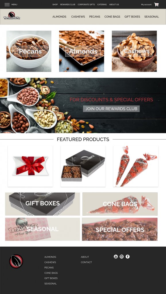
When putting together the mockup, I quickly realized that they would need all new photography for their website. The Corporate office agreed to ship me their products so that I could create new photographs for their website (I also knew this would help the website’s visual designs while not having to use stock photography).
After the first meeting and some user testing, there was a request to add an Events page, and that the Home page should link to the Events page. I emailed the first idea for an Events & Venues page:
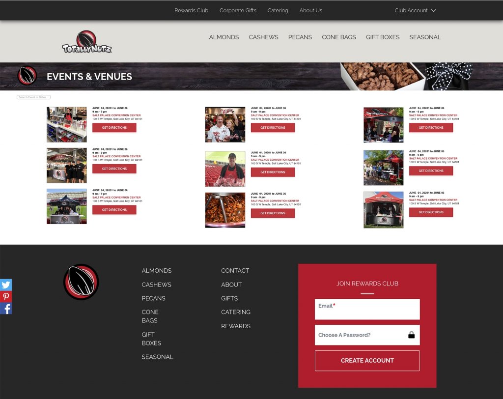
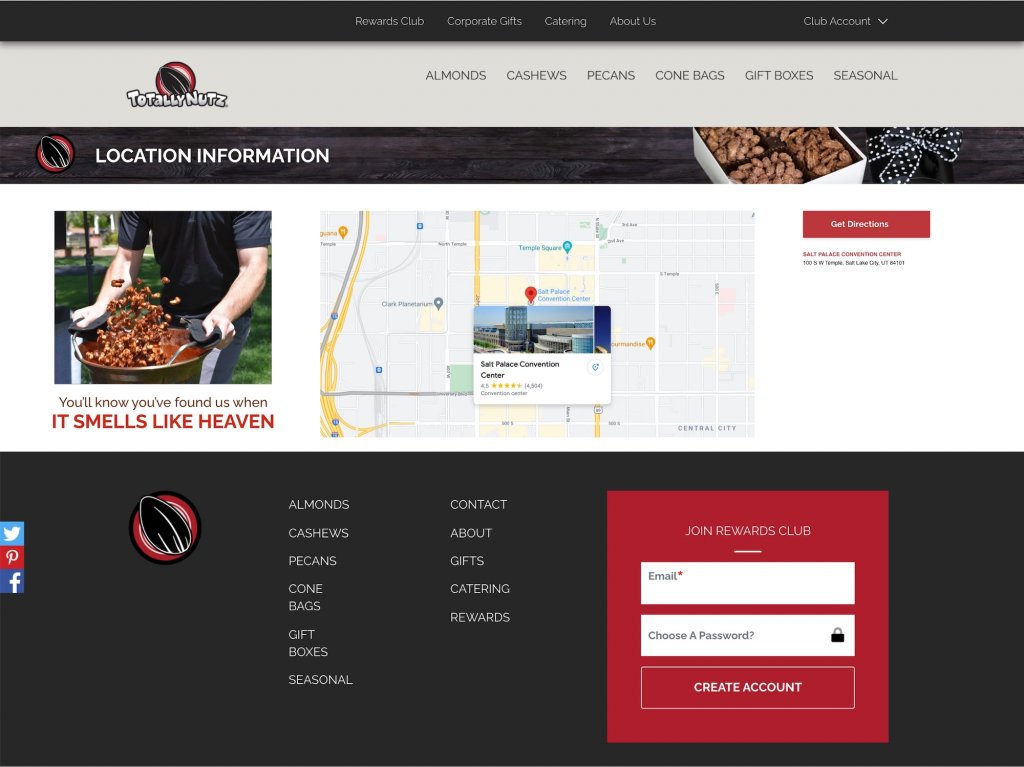
During the user testing, we discovered that there should be a way for Even Coordinators to request Totally Nutz for their events (i.e., festivals, farmers markets, carnivals, etc.). With that in mind, Corporate approved the basic layout and told me to go forward with creating a prototype.
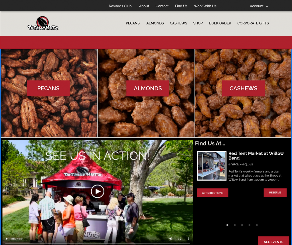
After I finished photographing all the Totally Nutz products and implemented the ‘link to the Events’ from the Home page, I re-worked the design of the home page and submitted it for user testing:
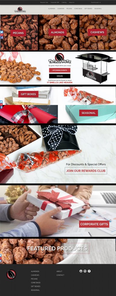
Corporate really liked the new look of the Home page and requested that we find a way to add a video to the Events section of the Home page, this way online customers could see first hand what the fresh-roasting looked like. They also requested that we have the section in the middle (that is divided into four parts — Seasonal, Gift Boxes) be an optional view. We decided to make the four-part view optional and also allow the franchisees to have those sections be full-page banner sized instead or even have the option to not have those sections at all.
The video was added to the Home page, along with a rotating “Event Slider” that would show the upcoming events and venues, along with linking to the Events Page when either clicking on the event itself, or hitting the “All Events” button.
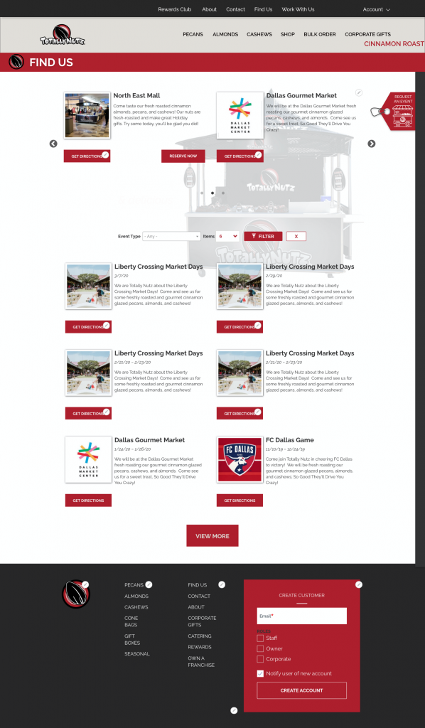
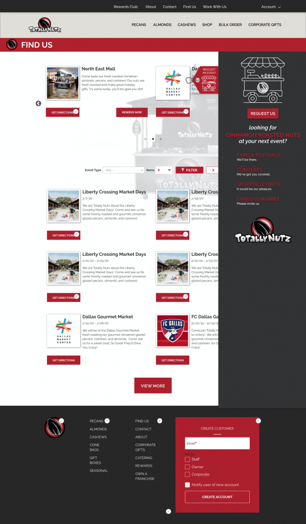
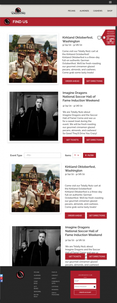
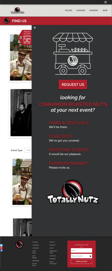
I updated the designs for the Events page, along with designing a pull-out from the right-hand side of the page with a tag that reads “Request an Event”. I also designed some Icons for the website, including a little Nut Roasting Card for the pull-out.

The following picture shows the revised Events or “Find Us” page with the pull-in on the right:
Following is the design for what the page should look like when the pull out is open (after clicking on the tag).
The photo on the left shows the closed version of the mobile design, the photo on the right shows the open version of the pull-out for mobile designs:
The rest of the pages went through a similar process during user testing.
Following is a look at the About page design for one of the Totally Nutz franchisees, dolliciousnuts.com
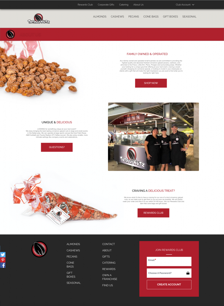
Following is another version/option of the same About page that I designed for another franchisee, thehappynutco.com
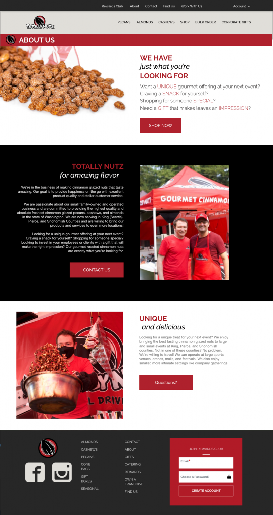
Each franchise is allowed to customize its About page. This is a way for each of them to personalize their individual sites.
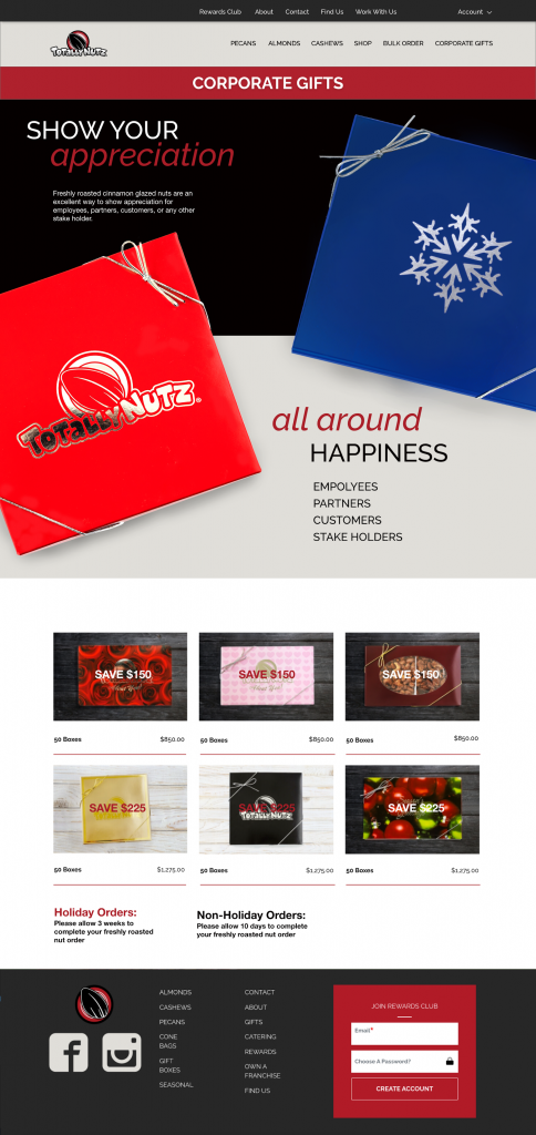
The Corporate Gifts page design was approved, along with the idea that each franchise can customize the wording on the page, if desired.
Next up: Revisions, Additions, and Mobile Designs!

Pingback: Totally Nutz Website | Phase 01 – Clever Christie
Pingback: Totally Nutz Website Phase 03 – Clever Christie
Pingback: Totally Nutz Website | Phase 04 – Clever Christie