
WIREFRAMES & FEEDBACK
You are viewing Phase 01: Wireframes & Feedback
View Phase 02: First Prototype & Feedback
View Phase 03: Revisions & Mobile Designs
View Phase 04: Launching Version 01
Main Concept
Build a Franchisee Website and Web Store that will enable Franchisee owners to connect to the Corporate Website to access a Corporate Library and also re-order franchise supplies.
My husband, Dan, and I are a 2-person team. I design websites, while Dan builds them. You could call us the “Chip and Joanna Gains” of Websites.
Our client, Totally Nutz Corporate, was very hands-off with this particular website rebuilt project, so Dan and I started from scratch. We gathered ideas and information, along with asking some of the Totally Nutz franchisees questions like:
What is working? What is not working? How can we make it easier to manage a website? If you could add a page or feature, what would it be?
Main Page Requests
The existing site had 4 main pages: Home, Shop, Find Us, and About Us
We based our designs on the existing pages, along with adding a couple more: Corporate Gifts & Rewards Club
Initial Wireframe Blueprints
Wanting to understand the needs of Totally Nutz Corporate and their Franchisees, I designed the above Prototype/Wireframes so I could get the initial design conversation started.
Following is a look at the 1st Run of the Website Wireframes:
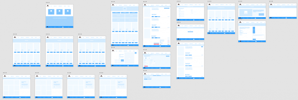
HOME PAGE
The home page would feature their three main nuts (3 main squares on the page): Almonds, Cashews, and Pecans
Each would lead to their own featured page:
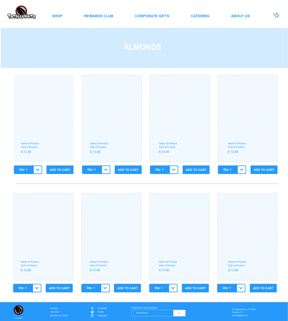
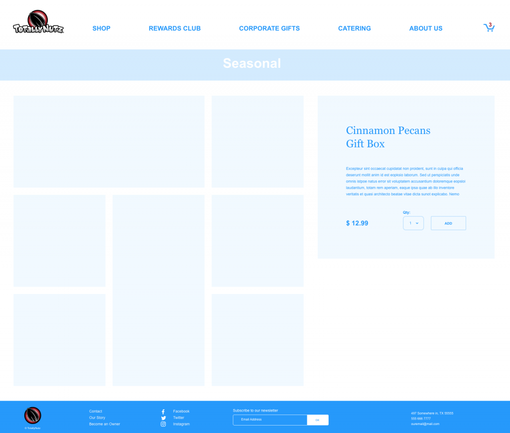
When on this page, I designed what a typical layout would look like when a customer would click on a product photo:
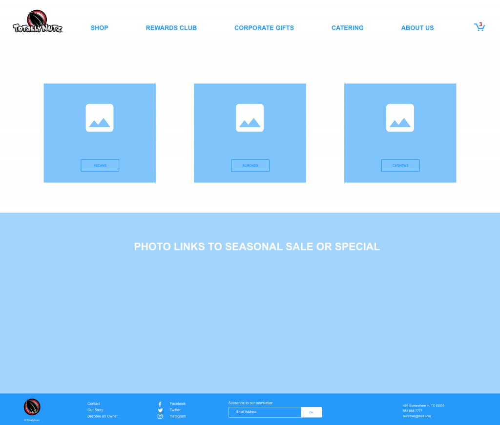
SHOP & FAVORITES WIREFRAMES
For the first run of wireframes, I wanted to give the client options and find out which features were most important.

Here is an option for sorting photos by page/shopping category (i.e., Pecans):
USER TESTING FEEDBACK | HOME, SHOP & FAVORITES
After some user testing from our client, we received the following thoughts and feedback about the HOME and SHOP pages:
We should combine the HOME and SHOP pages. Keep the three main nuts categories at the top, they need to be prominent on the page, like they are in the wireframes, but add more to the HOME page as you scroll down (like on the shop page). Possibly have links for single sorted pages for Bags, Boxes, and Seasonal.
SHOP PAGE: “Gift Boxes”, “Cone Bags”, “Seasonal”, and “Special Offers” should point to pages that allow for more than one product to be displayed. Put more info on the “gift boxes” target page.
Product Close-up page
When you click “+ favorite” you’ll be presented with a form that lets you give a name to the list or select an existing list.
Underneath products there could be:
{on left 50%}: a cross-sell area … “maybe you’d like?”
{on right 50%}: a mini CTA banner that randomly rotates in “corporate gifts”, “special offers” or “catering” banners
In “multi-product mode”, RH product details are sticky for long pages
The image in the left-hand column acts as a hover/change target for the right-hand info display column. Each image could have the product name as an overlay. On hover, the details in the right-hand column would change to match the hovered product
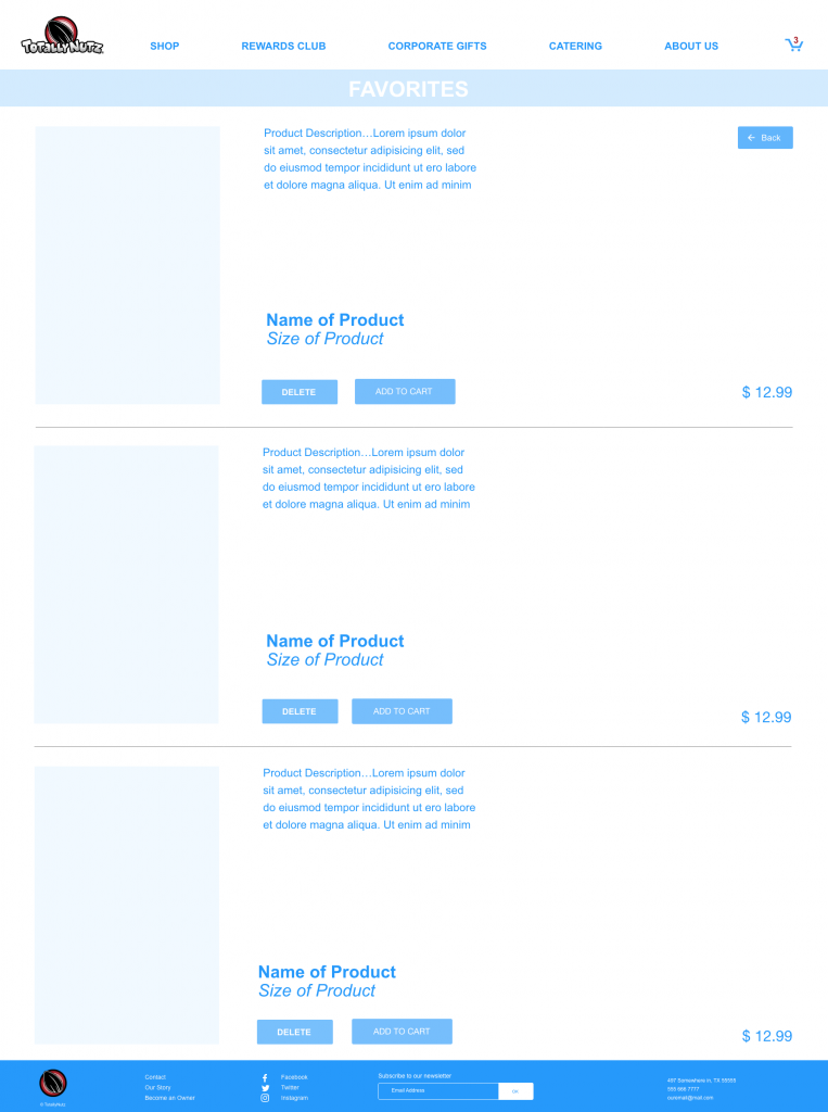
FAVORITES PAGE:
The user could have “favorite groups” like an Amazon shopping list. When adding a favorite the user could select which favorite group they want to add the product to with a “select or other” widget where “select” shows available lists, and “other” allows creating a new list. Perhaps add a select list pulldown in the “favorites” header; left or right as “select or other” pulldown.
Other product displays should also have an “add favorite”.
CORPORATE GIFTS • REWARDS CLUB • ABOUT WIREFRAMES
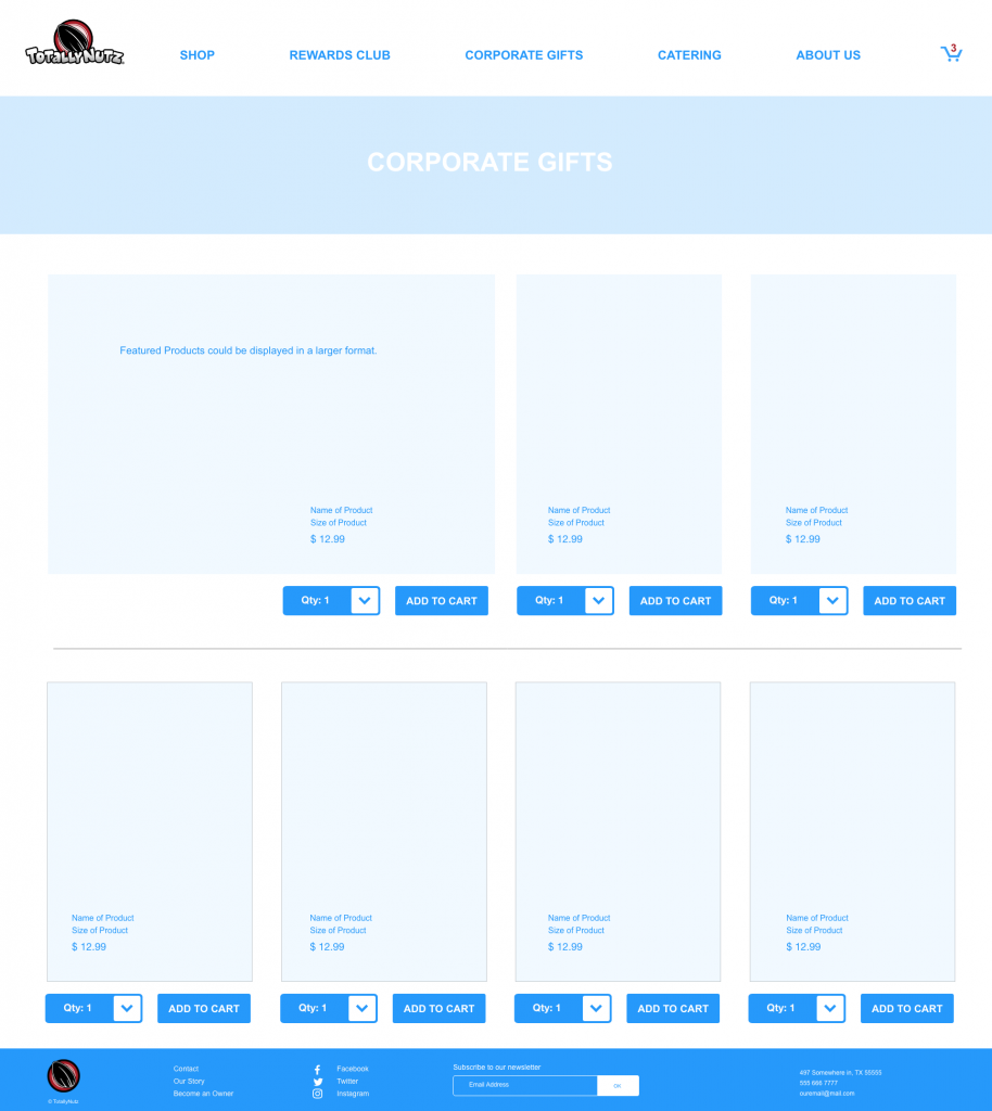
The idea behind a Corporate Gifts page is that a customer could get a discount for purchasing a lot of products for employee gifts (i.e., 50-100 boxes would get a 10-15% discount).
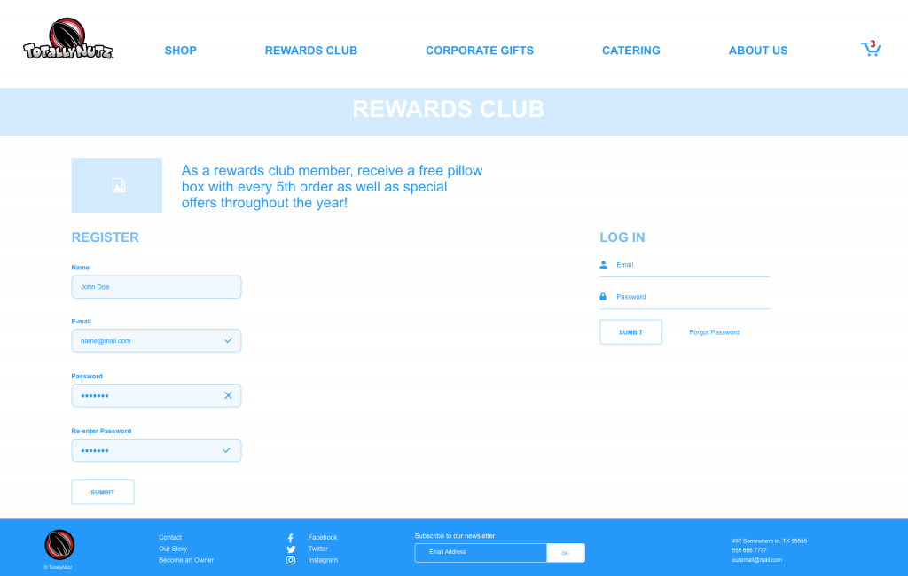
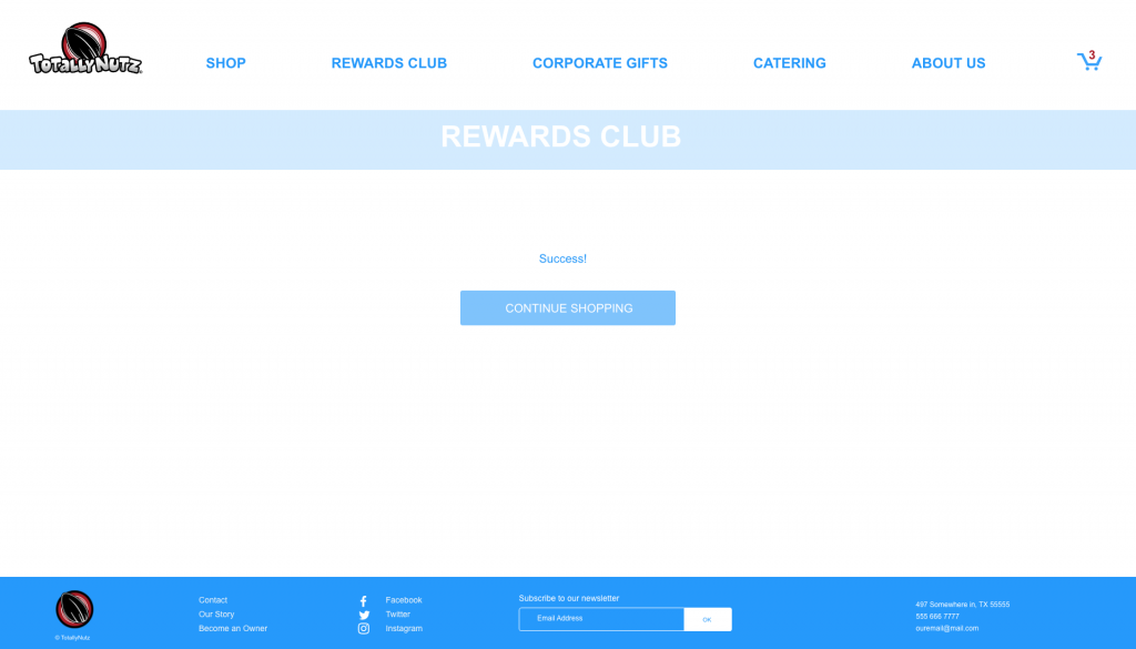
The idea for the Rewards Club Registration page and a page to let the customer know their registration was successful:
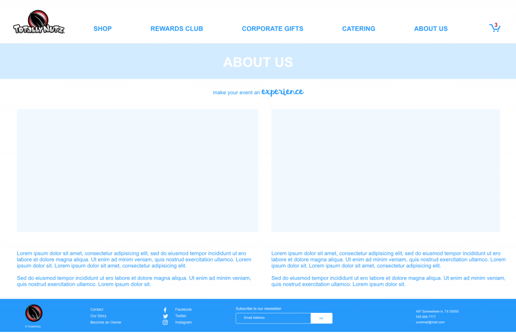
A simple “jumping off” idea for the About Us page:
USER TESTING FEEDBACK | CORPORATE • REWARDS CLUB • ABOUT
REWARDS CLUB PAGE:
IDEA: Banner at the top of the rewards club highlighting the idea that you “get free stuff” and make the text above for the “register” form bigger?
IDEA: ”submit” buttons should have intent labels instead? For example “create account” and “login”
After “SUCCESS!”: the message should say something like: “we’ve sent you a discount code for 10% off your first purchase to your-totally-real-email@email.com. Click on the link in the email to activate your account”
Instead of a CTA as a button, we show 4 banners; like on the top of the “Shop” page? The three banners would be top: 50/50 “Buy Stuff” → shopping page and “Featured”. Bottom 50/50 “Corporate Gifts” and “Catering”.
MEMBER LOGIN PAGE:
Ideally clicking the link would fade out the “login” form and fade in the “forgot password” form.
BOTTOM PAGE BANNER:
Not all franchisees will have/want to display a physical address
CART & PAYMENT PROCESSING WIREFRAMES

FEEDBACK
SHOPPING CART PAGE:
After the 2nd (if many) or 1st (if one) product in the shopping cart we inject a CTA (banner) that lets them choose items — as a pop-in? — from their favorite lists to add to their current cart.
Add a field below member discount that says add discount code, and underneath “Member Discount” (in subtotals area), when not logged, show button that says “get member discount”.
POP-UP FORMS IN SHOPPING CART
the form that has a field for an email with description: “Join our rewards club to 10% off your first order” a login form with the description “login to get your membership rewards” PAYMENT COMPLETE
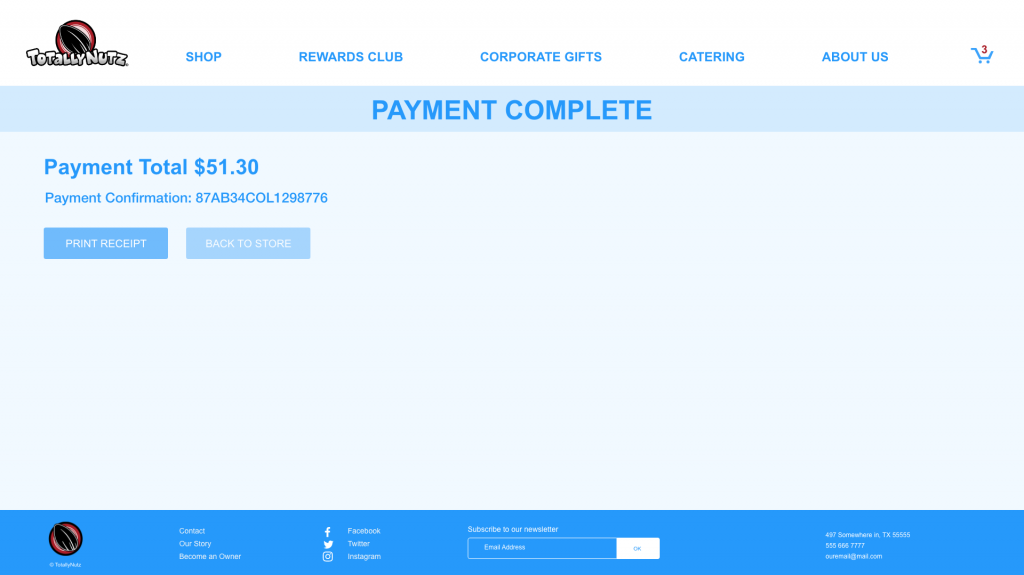
IDEA: add an invoice table with a list of products?
BOOK AN EVENT (CATERING) PAGE
The Basic Idea for a page to book events (the franchisee we worked with preferred the page be called, “Catering”).
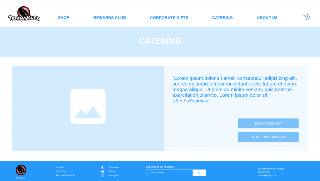
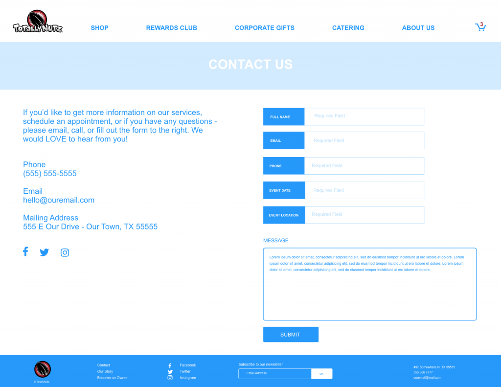
CATERING PAGE
“Submit” button should toggle in an overlay or go to a page that shows a message: “Thanks for getting in touch”, shows the message that they sent, reiterates the contact details in the LH column, and offers a button to print the contact info and their message… maybe reshowing the user’s message on the thank you page might be a bit much?
Pingback: Totally Nutz Website | Phase 02 – Clever Christie
Pingback: Totally Nutz Website Phase 03 – Clever Christie
Pingback: Totally Nutz Website | Phase 04 – Clever Christie