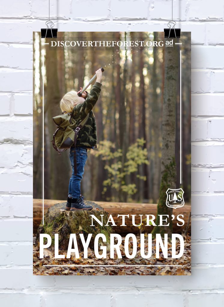
Creative Ad Posters
posted in Surface & Pattern Design, Illustration, Graphic Design, Information Design by admin on April 4, 2020The Challenge
Created two advertising posters for two different clients: DiscoverTheForest.org and She Can STEM.
The Requirements for Both Posters
Must be 11 x 17 inches and in portrait orientation.
Must show The Ad Council logo.
Must have a headline, logo, and URL for the company.
Must show a tagline or secondary headline.
Discovertheforest.org Poster

About Discover The Forest
I chose to design a poster for DiscoverTheForest.org because I feel strongly that children should explore the outdoors. Personally, I love nature and one of my all-time favorite activities is hiking.
DiscoverTheForest.org is a wonderful resource for parents or caregivers to easily find family-friendly activities for enjoying the outdoors. Their website is bursting with wonderful information and links that aid parents in helping their children to explore nature.
About the Poster Design
During the design process for this poster, I kept coming back to the designs with children hiking with their families. I tried some #optoutside designs that didn’t include people, but they didn’t instantly evoke the idea I wanted, which is: children naturally learn when they explore the outdoors. I finally decided to go with the photo of the young boy in the forest. I chose, Nature’s Playground for the poster’s title because I felt it was a perfect fit for the idea I wanted to portray.
Because the photo I chose was originally landscape-oriented, I had to do a lot of tweaking to the top and bottom to ensure the poster was portrait-oriented. When adding the typography, I came up with a design that would add to the photo instead of distracting from it. The photo itself is pretty busy and I didn’t want to overwhelm the poster. I tried several different typefaces and colors, finally deciding to go back to white.
For the final touches, I added some ‘magic’ coming out of the little boy’s telescope. The sparks are a subtle hint that discovering the forest is magical for children.

About She Can STEM
She Can STEM is all about empowering young girls. She Can STEM shows girls how cool (S)cience, (T)echnology, (E)ngineering, and (M)ath can be. She Can STEM introduces these girls to professional women who are making a difference by working in one of the STEM fields.
I first heard about STEM when I noticed their logo on a box of Girl Scout Cookies. Reading about how She Can STEM supports young Girl Scouts in their efforts to become future entrepreneurs immediately made a positive impression on me. When I was given the opportunity to create a poster for She Can STEM, I was instantly excited!
About the Poster Design
I was very inspired by ideas for She Can STEM, making it hard to narrow down and stick with one. I ended up combining a few different ideas into one poster. I created the illustrations and typography (seen on the chalkboard) by hand and used photoshop to add them to the background. The original photograph did have a chalkboard but it was a light green color and did not show the chalk very well. I added the dark chalkboard background to help the chalk drawings stand out a bit more.
To make sure the STEM logo, Ad Council Logo, and the @shecanstem link were on the poster, I added them to the chalkboard with the other illustrations. Even though I kept these items a bit brighter than the other illustrations so they could stand out a little, I really like the way they still blend nicely with the other illustrations on the chalkboard.
