Book Cover Design
posted in Surface & Pattern Design, Book Arts, Surface & Pattern Design, Illustration, Graphic Design, Information Design by admin on March 7, 2020
The Challange
In one month, create three different book covers for the classic tale by Lewis Carroll, Alice’s Adventures in Wonderland.
Project Requirements
Each cover should be designed in a different style. Create the first use type only, the second needs to be handmade with physical media (i.e. photography, collage, painting, illustration, etc.), and the last cover needs to be illustrated.
Type Only Design
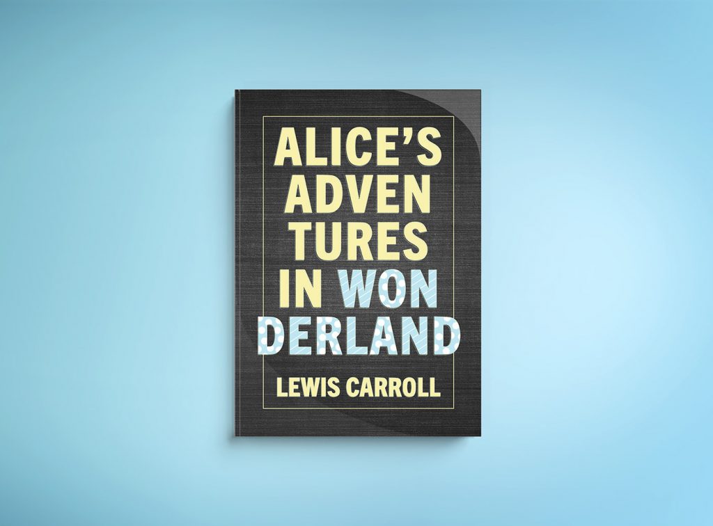
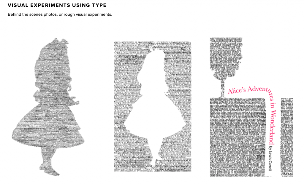
When designing the type only cover, I went through several iterations. I started by using type in a variety of sizes to create pictures. In one version I created an outline of Alice with type, in another, I created an outline of a teacup with type. I even went through several versions of my final design (seen above). I had some lighter pastel versions but in the end, I liked the dark, textured background. If you zoom in, you can also see the tiny lines around the type–it gives it a 3-dimensional feel.
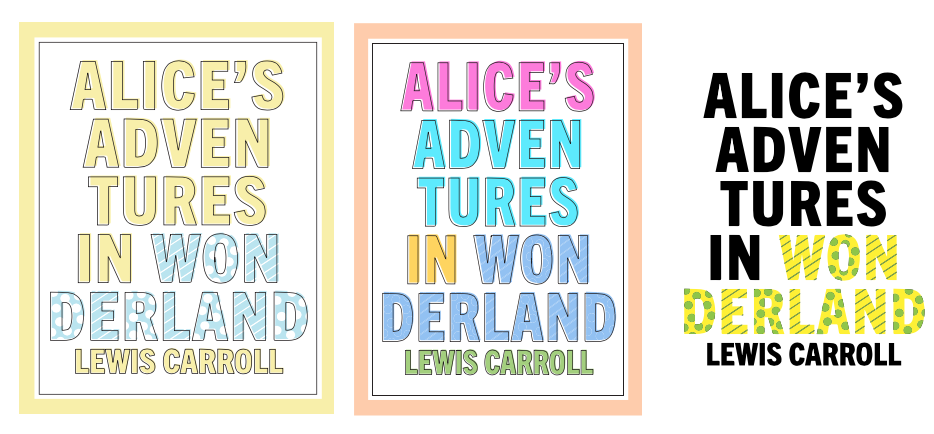
I’m happy with the results of the type only cover. I really like the contrast between the dark background and the light type–it feels pleasing to the eye. I tried to create a lost-and-found feel with the title, then added extra design elements (stripes and circles) to help the word, wonderland stand out a bit more.
Physical Cover
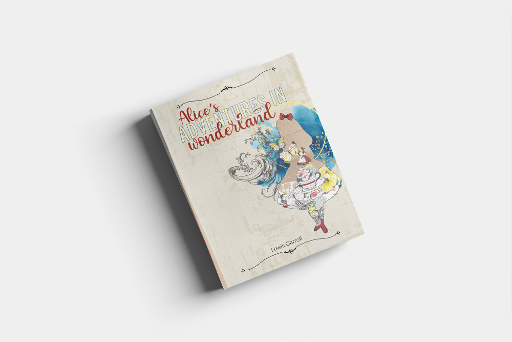
The evolution of this cover was quite an extraordinary experience. From humble beginnings of hand-sketching to crafting, collage, stamping and then scanning it all in to tweak it digitally.

I’m really pleased with the way the physical cover turned out, it’s a mixed media creation, which is my favorite way to design. I love handling paper, pens, scissors, paints, and inks. I also love to create digitally as well. The most enjoyable part of this cover was creating the texture for the cover background and the yellow inside of the “Adventures in” portion of the title.
Illustrated Cover

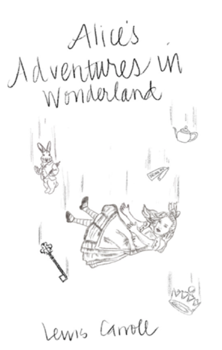
Creating the illustration cover was a pretty organic experience. I started with sketches of Alice falling down the rabbit hole. I wanted to create the dirt in the hole for the background but it just didn’t feel right. I also tried creating the rabbit hole from different perspectives. I ended up with the perspective looking out from inside the hole. I really liked this and started by drawing Alice looking down through the hole. In the end, I used the White Rabbit. It feels like a prequel, the very beginning before Alice follows him.
I really enjoyed this project and hope to create more book covers in the future
