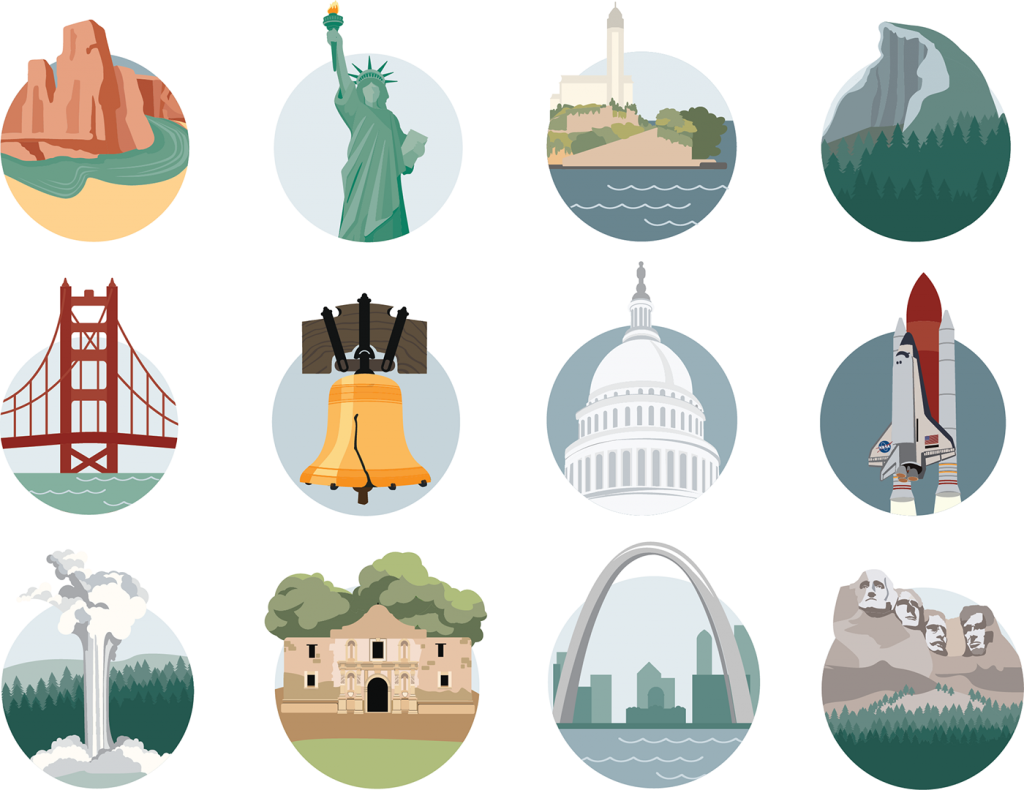
US Landmark Icons
posted in Surface & Pattern Design, Illustration, Graphic Design, Information Design by admin on September 29, 2021The Concept
A little over a year ago my family started planning a road trip (plus a few flights) to see the Fifty United States. The plan is to rent an RV and take off for at least 3 months (aka an entire Summer) to explore the mainland.
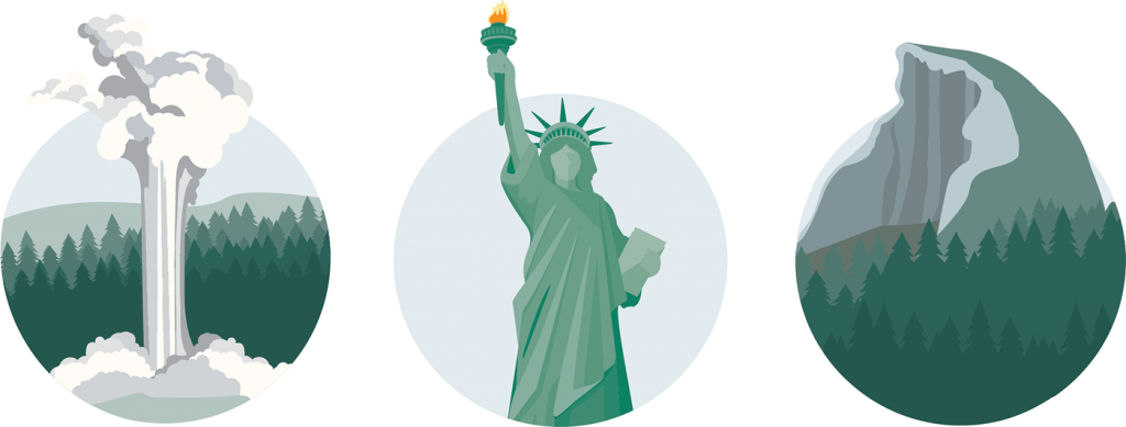
I started researching which US Landmarks were must-see’s, that way we could plan our trip around them. My US Landmark research inspired my icon designs.
Sketching
Even though there are fifty States, there are definitely more than fifty US Landmarks. I thought I would narrow it down and start with just twelve of them. Then, I started sketching some ideas. Because the icons would be for my family, and my children are now adults, I wasn’t worried about making them too cartoonish or ‘kid-friendly. Eventually, I want to use the icons in my Vacation Planner and potentially turn the icons into stickers.
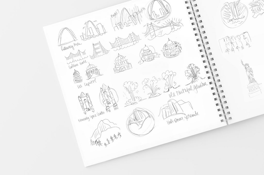
Digital Sketching
I started creating some digital sketches in Adobe Illustrator. The first 2 icons I worked on were the Statue of Liberty and the Liberty Bell. Because I love illustration, I found that I always started with quite a bit too much detail and had to hone each of them in to make the icons feel less like stickers and more like icons.
I also experimented with color by trying to make the Liberty Bell green to match the Statue of Liberty. In the end, I used the same colors I used in Lady Liberty’s torch flame for the Liberty Bell.

Getting Feedback
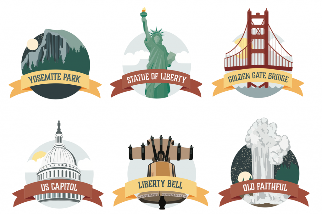
Once I had six icons, I reached out to some fellow illustrators for some feedback. Some of the main notes I received were to simplify them more and to get rid of the ribbons. Since Icons are usually small, the little details tend to get muddy when icons are small.
Making Changes
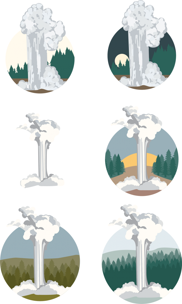
Receiving feedback from others really helps me to see my designs in a new light. I was challenged to make my Old Faithful icon look less like the standard seen on all of the Yellowstone signage. This challenge was just the push I needed to create something better than I had previously.
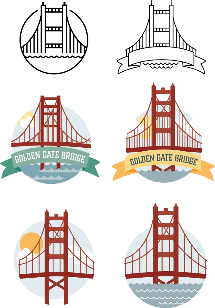
I pushed my Golden Gate bridge pretty far with the supports. Simplifying with fewer bridge support wires was the key change.
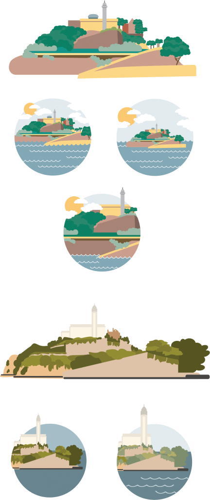
Alcatraz posed a big challenge, especially because I had the subjects of each icon sticking out above the main circle. I experimented with placement and eventually scratched my first idea and created a completely different version of Alcatraz.
Final Product
After many experiments with color and simplification, I ended up with twelve US Landmark icons that I am please with.
Now, I’m ready for that road trip.
