
Pepsi. My soda of choice. My husband likes to call Pepsi his preferred liquid candy bar. Pepsi is my favorite caffeine-infused-pick-me-up. I like it fresh from the fountain, in a foam cup, over some pebble ice. I may or may not get one exactly as described during my daily Maverick run.
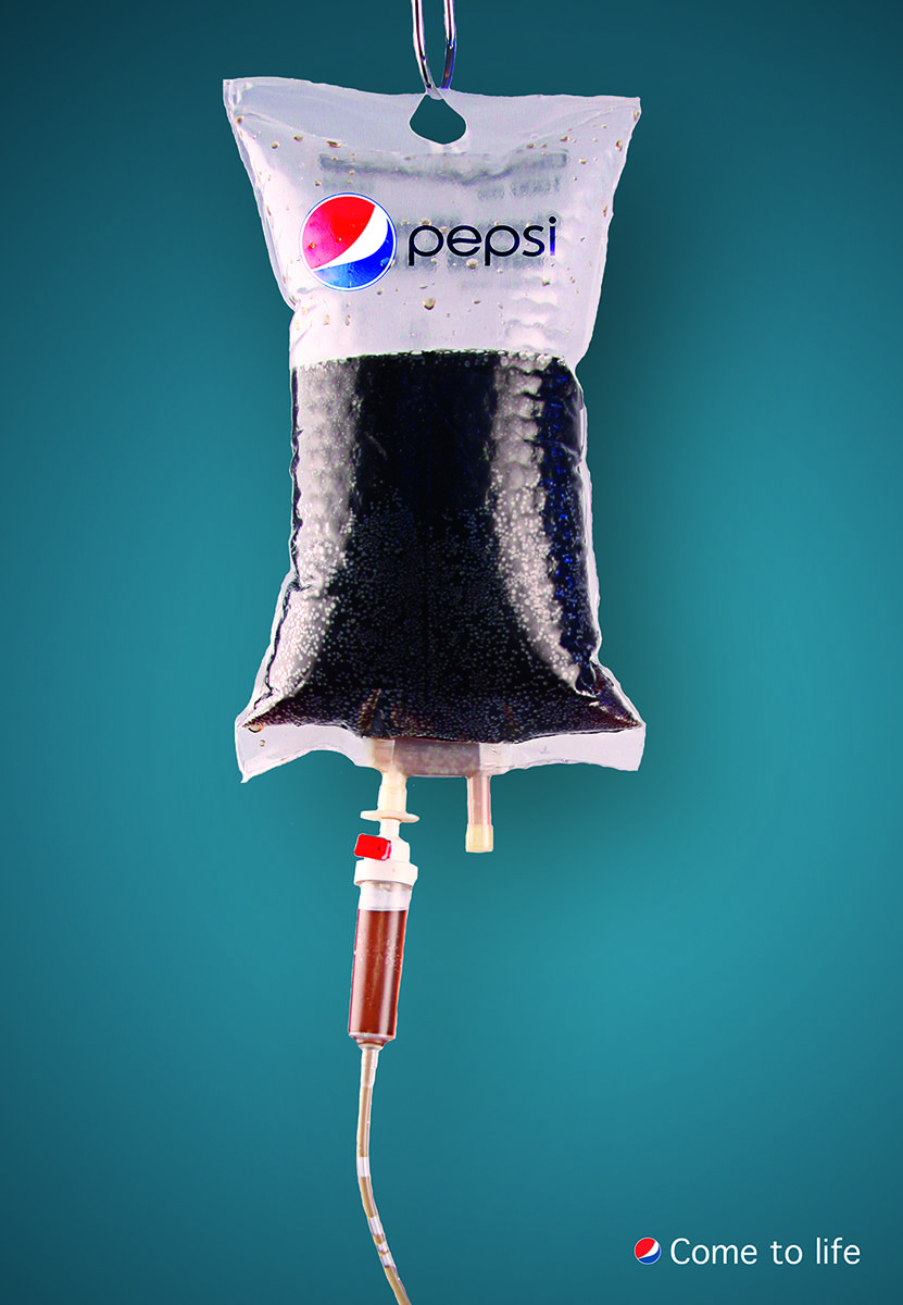
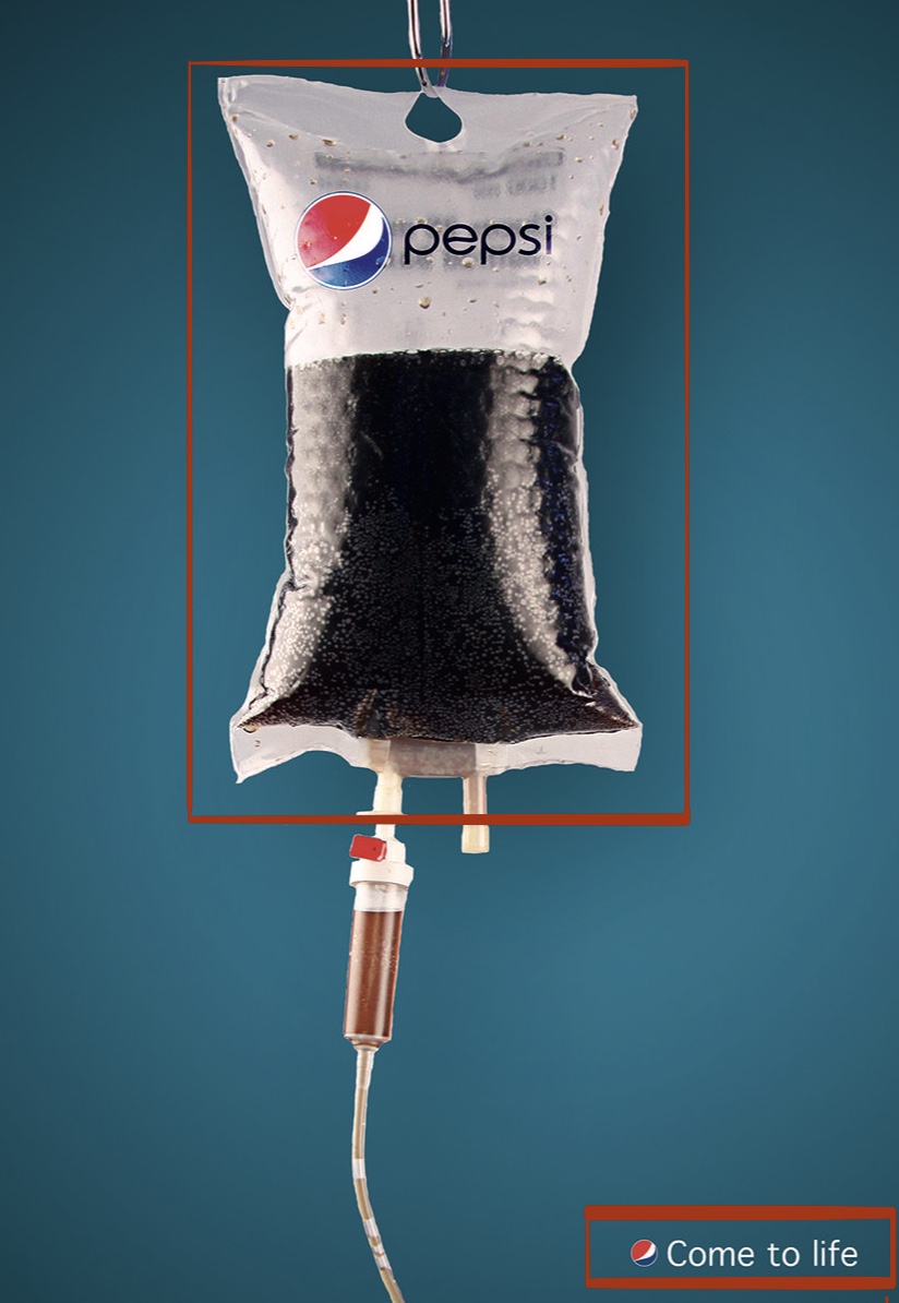
The above Pepsi ad was found on a food culture website called, ATERIET. I can definitely relate to this clever advertising. Some days I feel like I need Pepsi on an intravenous drip — straight to the vein.
I am new to the world of design but I will attempt to analyze how the original designer of this very creative Pepsi advertisement used the basic principles of design.
CONTRAST
The contrast in this Pepsi ad is undeniable. Our eyes are drawn to the large intravenous drip filled with Pepsi, which, I must say, is an ingenious idea. Then, our eyes float naturally to the bottom right-hand corner where we see the tiny suggestion to “Come to life”. Like I mentioned before, Pepsi pretty much brings me back to life on a daily basis.
REPETITION and COLOR
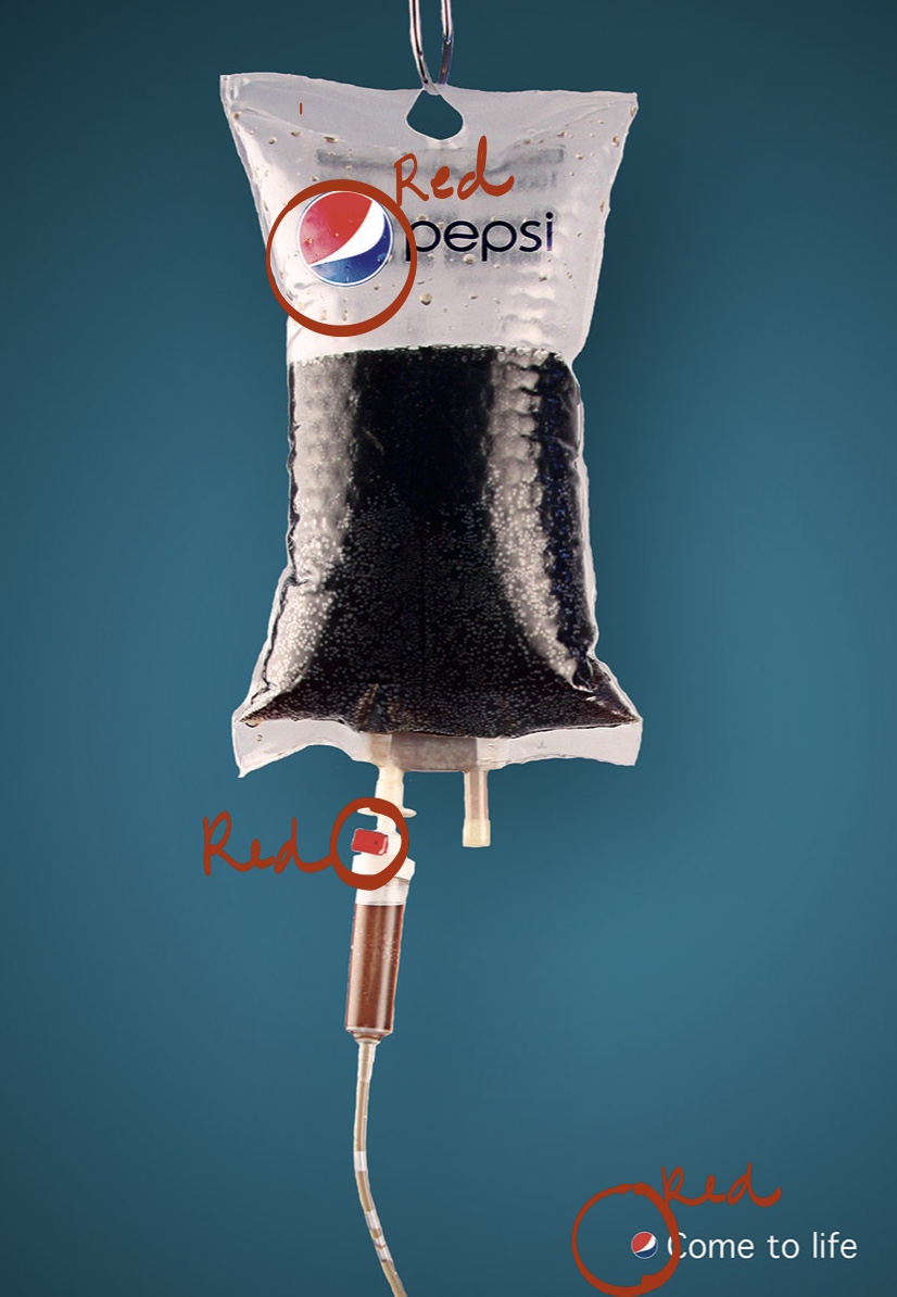
While not very noticeable at first glance, repetition strengthens this ad. There are two basic elements; the medical bag filled with liquid, and the separate words at the bottom of the page. The repetition of the Pepsi logo unifies both elements making us feel like they belong together.
Repetition and color go hand in hand. There are tiny pops of red on the page. The exact same color of red is used for the stopper on the bag and on both of the Pepsi logos – a shrewd, yet subtle way to use repetition. Also, the blue in the background helps the blue in the Pepsi logos to stand out as well.
ALIGNMENT
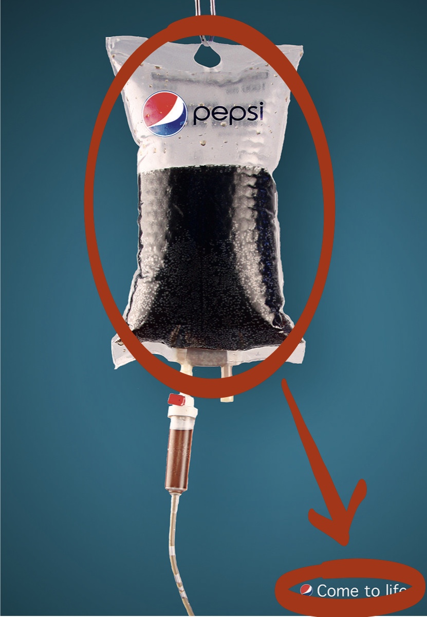
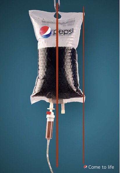
The center alignment of the main ad element is obvious right away. But the smaller ad element at the bottom of the page is not so obvious. The designer of this Pepsi ad stuck with the idea that elements of design should always align with something, even if they’re far away from each other. Like magic, the words, “Come to life”, are perfectly aligned with the right side of the Pepsi bag.
PROXIMITY
Because there are only two elements on the page in this Pepsi advertisement, our eye is drawn to the large intravenous (IV) bag filled with Pepsi first. This gives us the bold idea that Pepsi is a life-giving fluid. Usually IV’s are filled with a saline, or electrolyte solution and given to medical patients in the hospital to treat dehydration.
After we see that larger picture, our eye is drawn downward toward the small statement, “Come to life”. The spacing between the picture and the statement gives us ‘breathing room’ to come to the ironic conclusion ourselves while reinforcing the comedy in the tongue-in-cheek aspect of the advertisement. Very cunning — if I do say so myself.
One can see that even though this Pepsi advertisement seems like it may be simple, all the elements of design were well thought out.
Pepsi…sweet, sweet nectar of the Gods.
Yup. The principles of design are working their magic on me.
I’m kidding. Kinda.
I need a Pepsi.
I’m heading to Maverick, does anyone else want a Pepsi?