

Concept
For this project, I really wanted to create a gig poster that told a story and evoked an emotional sense of the music created by ÆTHER DRIFT. It’s difficult to capture the feeling of progressive-indie-folk-rock music, but I’m very happy with my final gig poster.
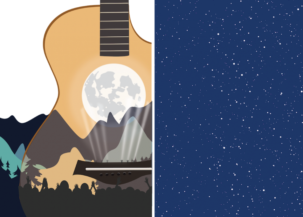
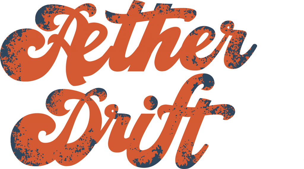
The word, æther means quintessence (or fifth element), it’s the material that fills the region of the universe above the terrestrial sphere. Right away I knew that I wanted to include the night sky in my poster design.
Sketches
I start each project with sketches and word lists; this helps to get my original thoughts and ideas down on paper. This process also sparks new and different ideas.
I decided to go with the concept of a guitar above the ground, in the æther. I chose my favorite idea from the sketches and then quickly sketched out a bigger version. Then, I added a little color to see if the idea was worth pursuing. I decided to go for it.
I wanted to place the band standing on the guitar bridge (like a stage), with an audience watching in the foreground. I also liked the idea of placing the moon where there is usually a hole in acoustic guitars.
Digital Sketches
Once I had the main idea down, I started sketching elements for the poster in illustrator. The mountains, moon, and guitar felt like a good place to start. Then, I started putting everything together, adding the crowd and lights for the stage. Afterward, I created a night sky so that I could start to figure out where I wanted to go with colors. Have you ever created a night sky? Let me tell you — I’ve never been so grateful for copy and paste.
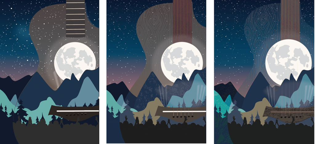
Once I started creating the poster, I experimented with the opacity of the guitar and ended up removing details that made it look too 3-dimensional. I also experimented with some textures on the mountains and wood grain on the guitar.
Embellishments & Type Experiements
One of the elements I wanted to incorporate from my original sketches was the flourishes. I spent quite a bit of time looking at pictures of flourishes, then creating my own. I even tried adding them to the æther band name.

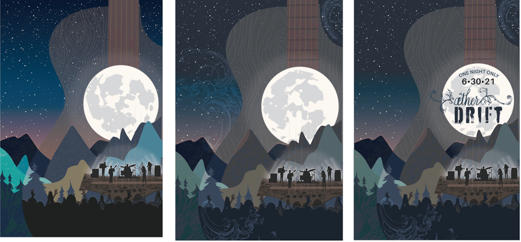
Next, I added a silhouette of a band to the ‘stage’ and sketched out where to place the typography. Keep in mind, what you see next was never meant to be the final typography, just thinking about where to place it on the poster.
Critique Drafts
After reaching out to friends, family, and fellow designers, I came up with some draft designs. Though I still wasn’t sure if I should even include the silhouette of the band, and if I did include it, I wasn’t sure if I should add lights behind them or not.
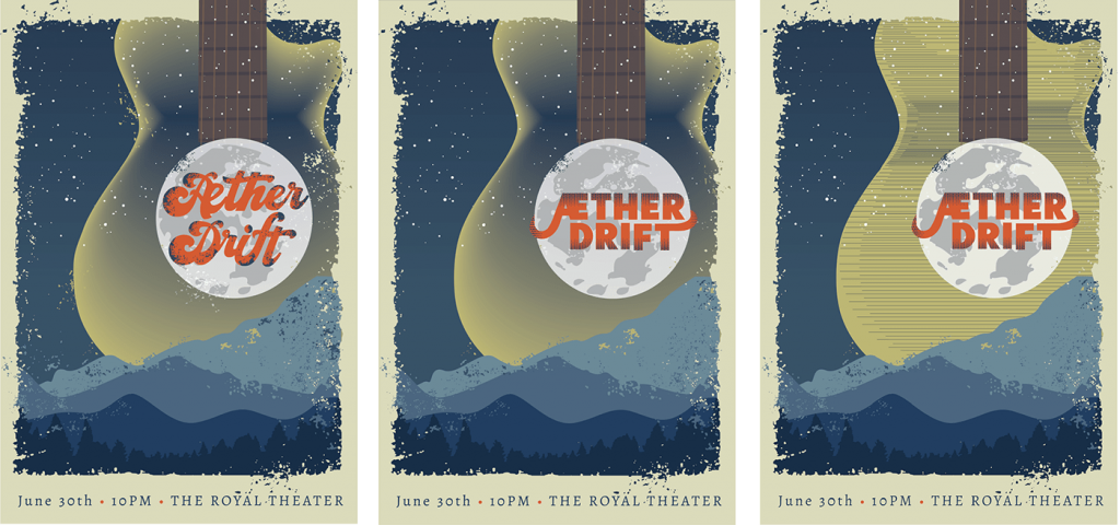
One person mentioned that I should try a design with fewer mountains, another said it felt like there were too many textures. For these next versions, I took out most of the textures, made the guitar bigger, and placed it in the ‘æther’ behind the mountains.
Final Changes
I really tried to make the flourishes work, but ended up getting rid of them. They just didn’t fit with the feel/mood that I was trying to create. As a matter of fact, it didn’t feel like any of the typography work. So I designed a couple of different versions of the band name.
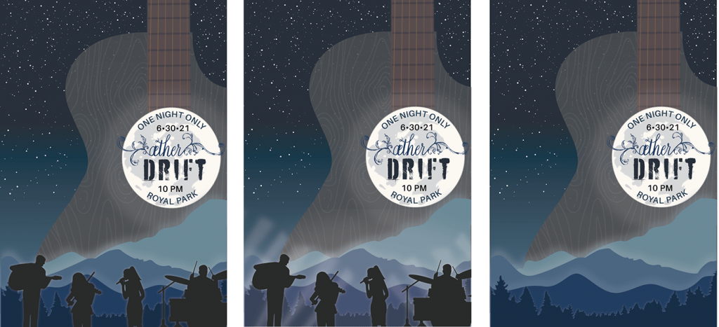
One thing I did know: I wanted to put only the band name inside the moon, the rest of the type would be at the bottom of the poster. Also, the client really didn’t want any fuzzy edges or gradients on the poster, so I reworked them even more to include lines, dots, and distressing to add shading and texture.

Final Critique
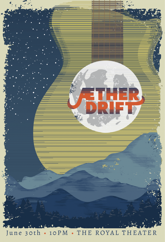
Above is the final version I shared for critique. At this point, I felt that the project was done. But after receiving some final advice, I ended up changing the shading on the band’s name from dotting to stippling; along with the background of the sky, the mountains, and the trees to all match the stippling on the guitar.
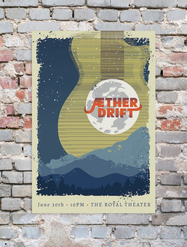
Finished Product
What I learned
The biggest take-away of this project was the experience I gained creating depth and shading using half-tone. I really stretched as an artist and designer with this project.
The final version ended up very different from my original sketches, but I’m so pleased with the result and feel that I pulled off the goal of creating a gig poster that really feels like the band’s music sounds.